
Choosing the Perfect Curtain Colors : A Palette Guide
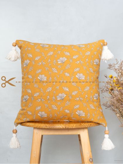
Every carefully curated detail in your home is a reflection of your unique style. This adds to the appeal of your home. Curtains are an integral part of your home interiors and elevate your living space. They serve both functional and aesthetic purposes in home decor. Curtains give your house a personality and style.
But with so many color options, picking the perfect curtain color might be intimidating. Did you know that contrary to popular belief, choosing the perfect curtain color to enhance the beauty of your home is simple. In this blog, I’m thrilled to walk you through the process of selecting curtain colors so you can make your home aesthetically beautiful and warmly welcoming, all the while reflecting and retaining your very own personal preferences.
Let me take you exploring the fascinating world of curtain colors together!
For you : A quick guide to the Color Palette.
Color Theory – Part 1
How to use colors in your space
Are you overwhelmed while choosing colors for your space? Do you like more than one color but don’t know how to pair them? I will break it down for you for easier understanding.
Color wheel to our rescue!! The color wheel is a diagram where the colors are arranged systematically by their chromatic relationship to one another.
Option 1: First pick your main color, the color that you love. For example, let's pick Yellow. Now pick the color that is opposite to yellow in the color wheel and that’s purple. Colors that are opposite in the color wheel usually work well together. You will have a high contrast color combination that gives a pop.
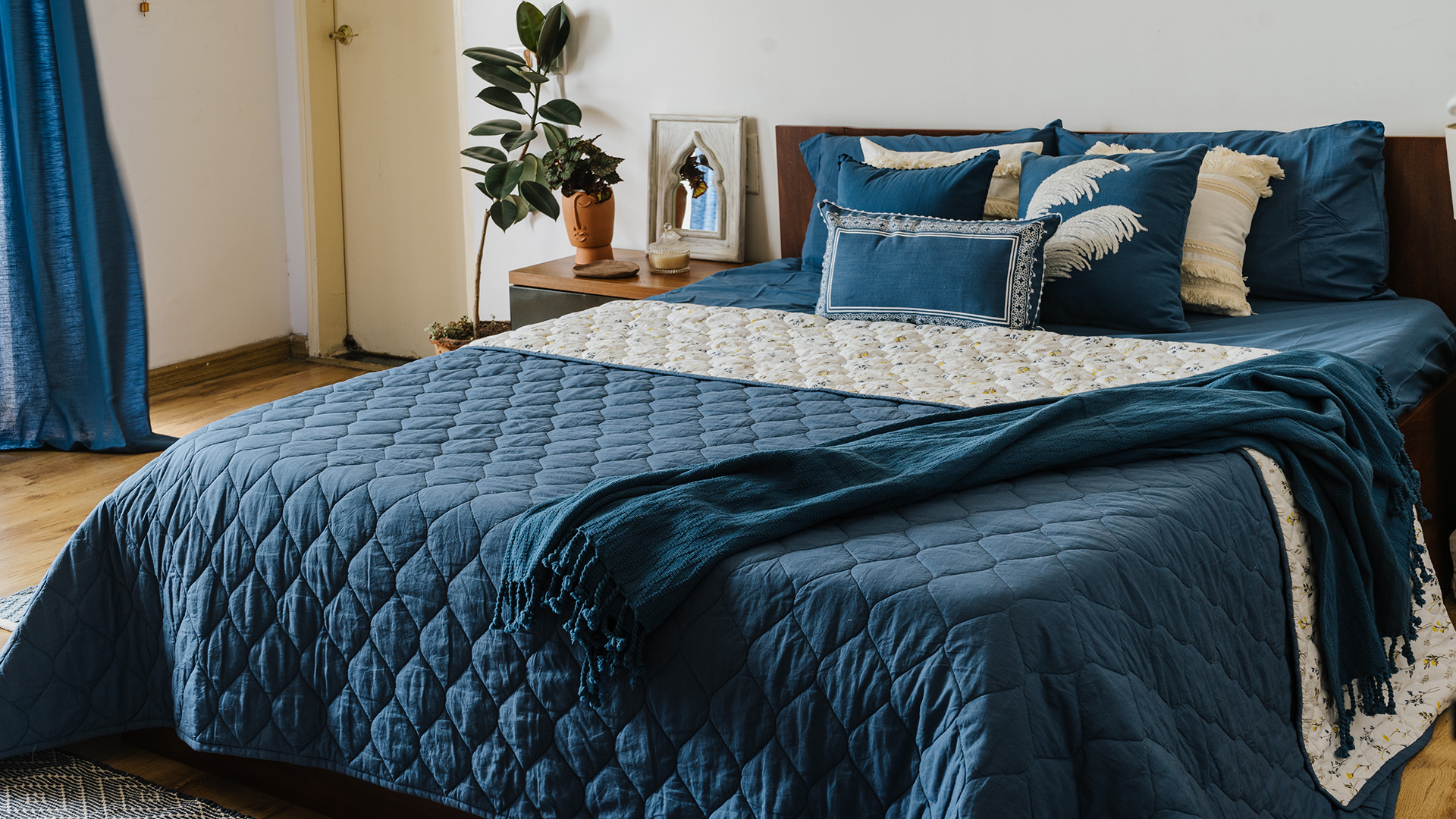
Option 2 : is to pick colors adjacent to each other in the color wheel. For example blues and green work great together and give you an elegant monotonal look.
In the next part I will tell you how to work with more than two colors and their proportions.
Color Theory – Part 2
How to choose more than two colors for your space.
We saw how to pick two colors that work well together. Usually as decorators we use more than two colors for a space. And this rule will help you in using colors in the right proportions.
The 60-30-10 rule. Let’s say we have chosen yellow, green and I usually like to add a neutral to the mix, so I am picking a warm gray as the third color. I would use warm gray as a neutral for 60% of the space, 30% of décor in yellow and 10% of sage green as the accent color. This helps in maintaining a color balance and achieving a harmonious look.
Remember these are just timeless guidelines that can help, not rules that are unbreakable. You can always choose to go heavy on a particular color or balance out the mix by adding a couple or more similar toned colors in varying shades of light and dark to create a cozy vibe.

Color Theory – Part 3
Did you know colors can be broadly classified into cool tones and warm tones.
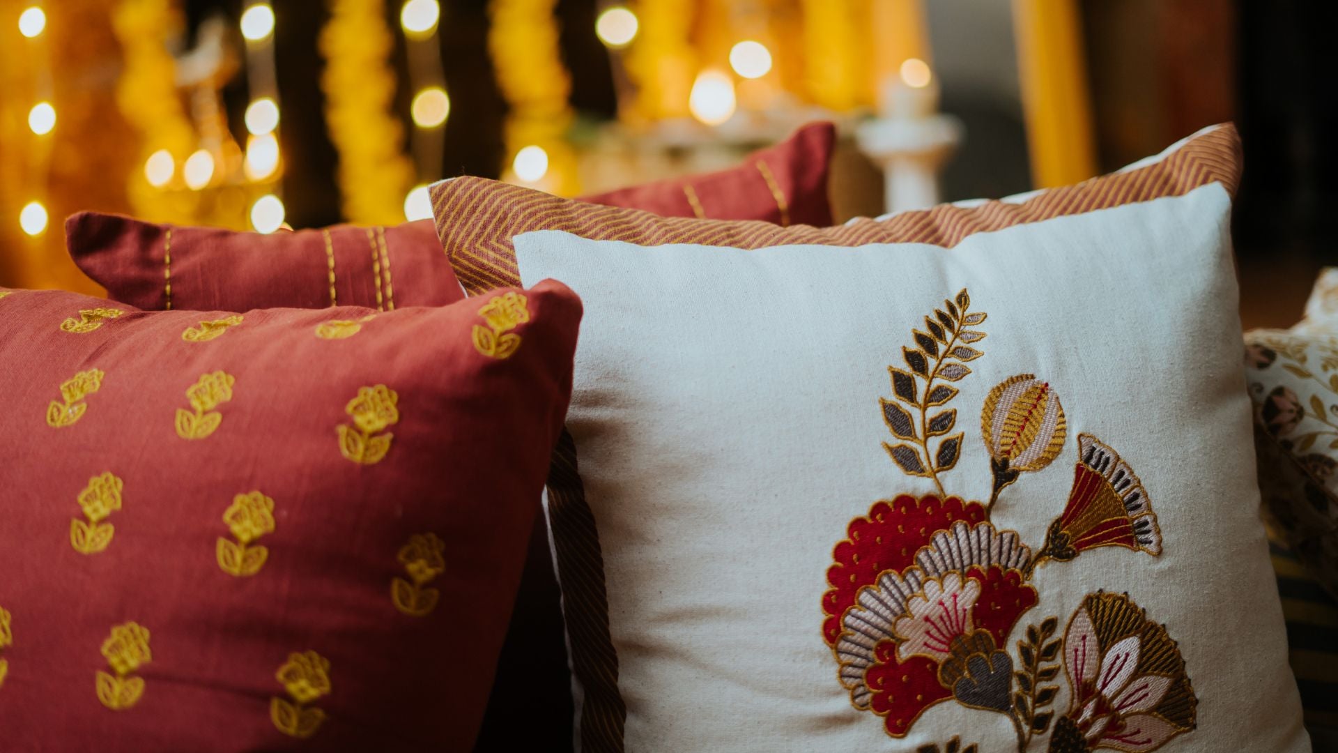
Warm colors are Yellow, Orange, Red and combinations of these . Warm tones breathe energy, positivity and a sense of sunshine into any room.
Whereas, Cool colors are Blue, Green and Purple and combinations therein. Cool tones evoke relaxation and calm. 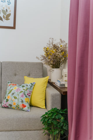
Neutrals like white and gray can also lean warmer or cooler depending on the undertones.
Some warm colors can have cool undertones and some cool colors can have warm undertones. For example: Green is a cool color though Lime Green has a lot of yellow in it , so it is a warm color.
A great example in Nature of a warm and cool color spectrum is a rainbow!!

So, why is it important to know the warm and cool tones?
Generally, shades that fall under the same tone work well together. For example – Shades blue, green and beige, falling under the warm tones work well together. And another set of three shades like dark blue, light blue and yellow falling under the cool tones work well together.
Each color possesses a unique ability to evoke different moods and feelings. And this drives the way we choose colors for our interiors.
Another common question is , whether we can mix Warm and Cool colors when decorating?
The answer is Yes!!
However, knowing the right tones to mix is quite important. Combining warm and cool colors in a room keeps the space interesting and quirky!!
Just remember the 80/20 rule : Strike a beautiful balance using 80% of warm or cool toned colors and 20% of the other. Also keep in mind the room’s usage and purpose and lastly try to match with the existing color palette of the interior.
Hope you found this blog useful and you find it easier to choose your favorite colors to spruce up your home! Leave us a comment if you did.